Comova Cycling
Rise with the Road.
Comova Cycling offers curated cycling adventures in Sonoma’s West County and beyond. Whether you want to hit the gravel, roll the coastal byways, or tackle mixed terrain, Comova Cycling can put together just the right cycling adventure for you. Founder Steve Zavestoski came to us looking for brand positioning, comprehensive identity, and web design to launch his new adventure cycling tour company.
POSITIONING & MESSAGING
BRAND IDENTITY
LOGO DESIGN
CUSTOM WEB DESIGN & DEVELOPMENT
PRINT COLLATERAL
Adventure is a state of mind; Comova guides you there.
Comova guides clients in finding new territory on multiple levels — in categories of cycling, in their skills and abilities, and within their own minds. Our challenge was to create a brand identity communicating that essence, in a way that spoke to both avid & recreational cyclists.
Opportunity
Create more access to cycling for more types of people.
Provide an opportunity for skill-building and confidence not previously offered by this category.
Wake people up to more joy and adventure.
Offer a deeper connection to nature, themselves, and ultimately more meaningful lives.
The overall vibe hits nostalgic notes, tuning in to our collective longing for simpler times, when a good afternoon was spent wandering around outside with friends on bikes. Both verbal & visual identity were designed to capture the essence of Comova’s roots in the coast, mountain, and valley roads of Northern California—expressing the joy of the ride and the depth of experience its founder and lead guide, Steve Zavestoski, provides.
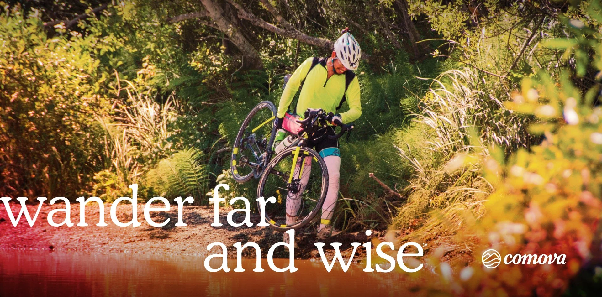
Wander far and Wise.
LOGO
The Comova Cycling icon illustrates the coasts, mountains, and valleys of California, for which Comova is named (co...mo...va). Paired with a custom script logotype, the Comova logo as a whole speaks to the beyond-category nature of the cycling adventures offered, in an accessible visual language with a hint of nostalgia for simpler times.
COLOR PALETTE
The Comova color palette draws inspiration from nature — banded gradients of warm and cool tones evoke sunsets, coastal waters, desert soil, and skies at any time of day. The palette also speaks to the range of experiences one might have on a Comova adventure.
TYPOGRAPHY
Cooper Light, a contemporary serif face with a vintage vibe and a friendly voice is used for headlines, and larger body copy. Adieu, an extended sans serif, offers more in-category styling, and a nice contrast to Cooper. Neue Haas Unica for body copy works well for digital reading, and imparts a contemporary sense of precision and confidence.
PHOTOGRAPHY
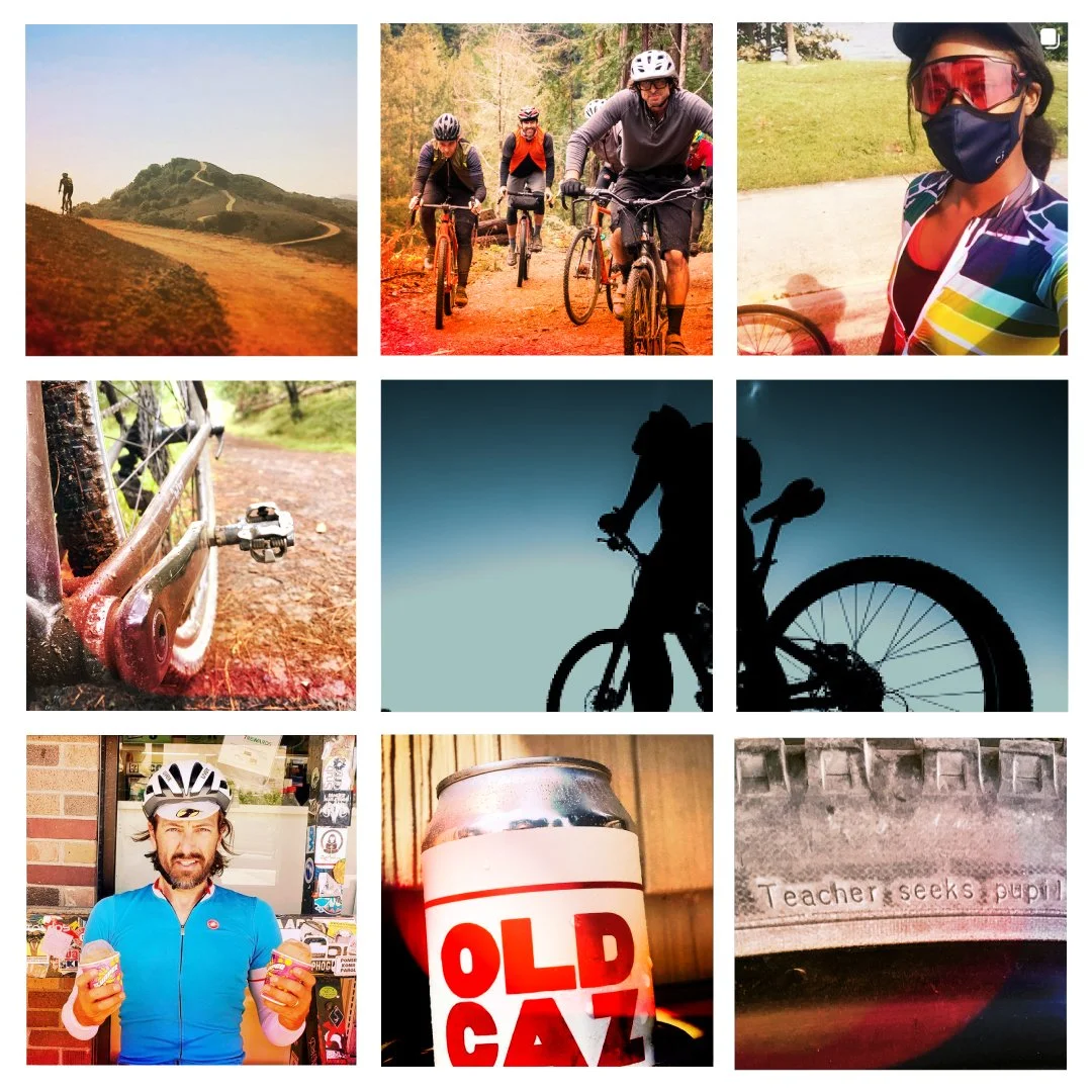
Photography plays a key role in expressing the range of possibilities on a Comova adventure. Shots should include a variety of terrain types, rider ability/demographics, and a range of views from wide angle scenes with open vistas to close-ups of equipment and natural elements. Show a variety of moments—pre, during & post ride—including highs and lows. Whether featuring groups interacting or solo moments of introspection, expressions should always be candid; never overtly posed.
Warm Glows
For a sense of immediacy, vibrancy, and consistency, add increased contrast and a warm glow to all other photos. This treatment ensures all photos have a distinctive “Comova” vibe—regardless of origin: fun, alive, gritty, and warm.
Graphic Silhouettes
For brand touch points that point to the shift in state of mind Comova Cycling offers, silhouettes of riders (alone or in groups) can be used in a monotone treatment. This approach highlights the internal experience and shift in reference point a Comova trip uniquely brings riders to experience.
“Working with Amy was so much more than a design process. It was a deepening and clarifying of our brand’s identity, values and mission. Through extensive conversations and exercises, Amy identified the heart of Comova Cycling and then created a brand identity that evokes its spirit. From icon and color pallette to typography, photography and copy writing, Amy’s team far exceeded my expectations.”
—Steve Zavestoski, Founder & Lead Guide
Writing: Jeff Schuller
Web Development: Adrienne Palmiere
Design Contributor: Sam&Mark
Typography: Alan Green


